CASE STUDY
Snazz
Native Mobile App
As technology becomes more ingrained in daily life, its impact on our physical and mental health is undeniable. Despite the abundance of productivity and mental wellness apps, there's a clear absence of those tailored to effectively reduce digital screen time.
I joined Snazz to support their mission of empowering users to develop healthier digital habits by offering tools and insights that help individuals and organizations leverage technology to enhance their overall well-being, rather than detract from it.
Company
Snazz
Timeline
September 2023 - April 2024
Tools Used
Figma
FigJam
Jira
ChatGPT
My Role
UX Research
User Journey
Information Architecture
UI Design
Design System
Usability Testing
Project Presentation
Quality Assurance
Short on time?
Skip to Wireframes
What’s the problem?
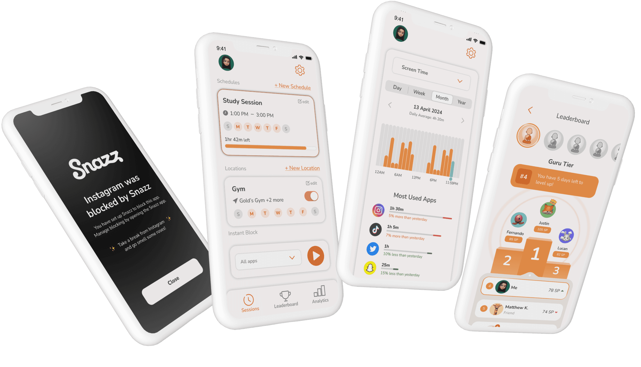
Snazz app struggles to differentiate itself from competitors due to a lack of distinctive features. While the minimum viable product (MVP) is functional, users question its value compared to Apple’s Screen time feature. Additionally, the outdated interface deterrs user engagement with the app.
Our team began the journey with these goals in mind:
Update the mobile app’s interface with modern design trends, ensuring accessibility for users and maintaining brand consistency.
Design and integrate a unique feature(s) that will distinguish Snazz from competitors.
What do our users need and why do they need it?
To generate new features, we engaged users in discussions about their mobile device usage, gathered feedback on their current experience with our app, and explored their history with productivity and screen time apps.
Based on the feedback from user interviews, we analyzed competitors focusing on key features such as time management, goal setting, social sharing, schedule automation, and screen time tracking
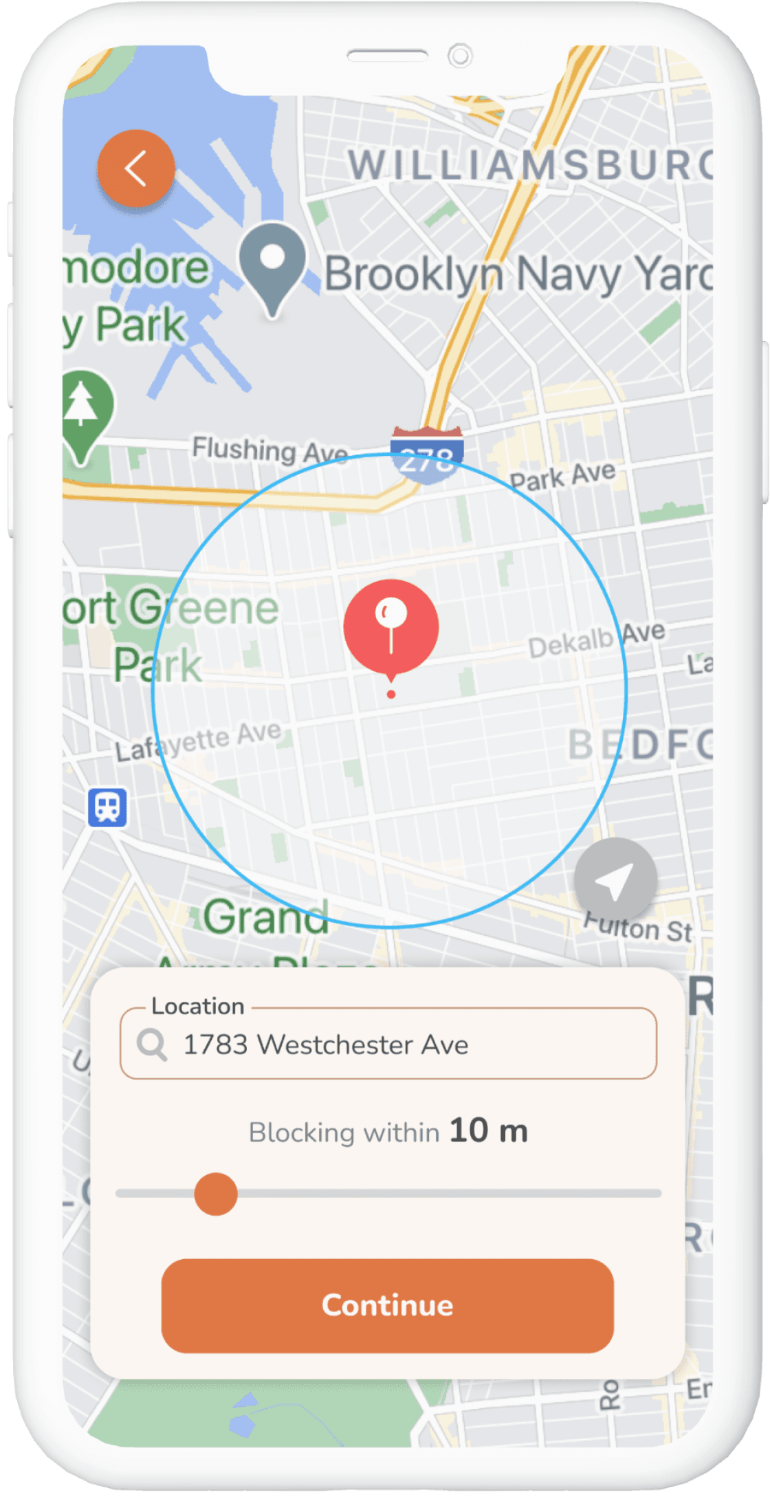
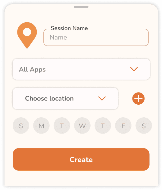
Integrating Geofencing Technology for Location-Based App Blocking
Many users expressed difficulty in controlling their screen time and reducing distractions in specific locations, such as workplaces, schools, or libraries.
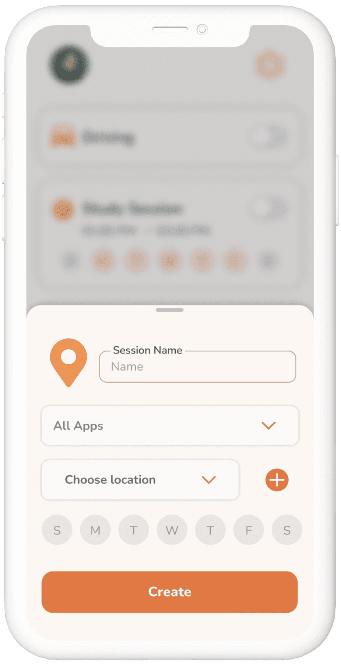
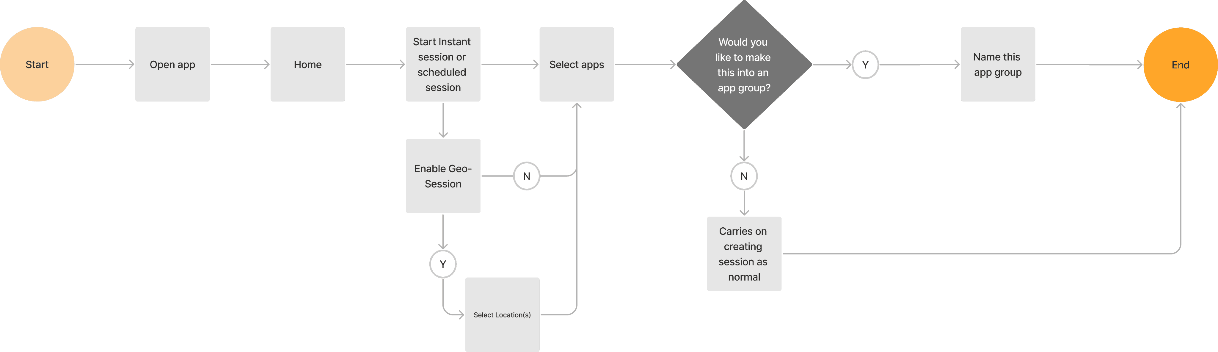
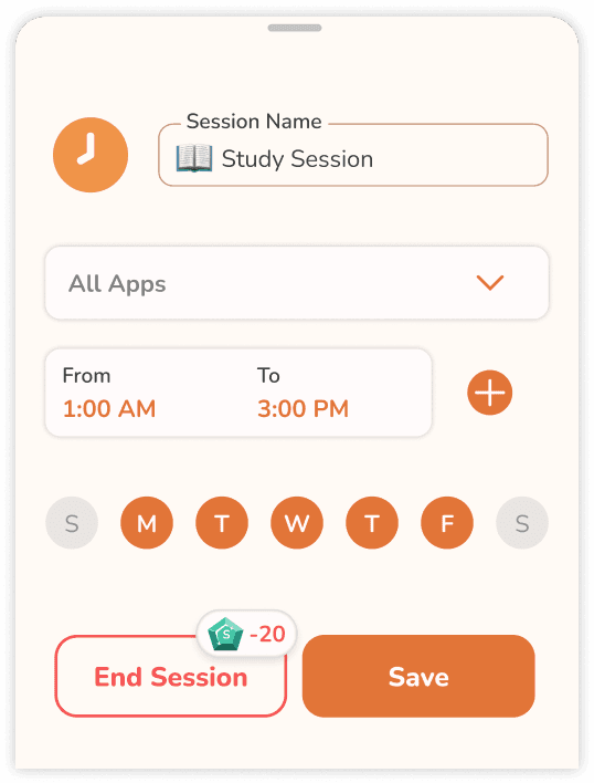
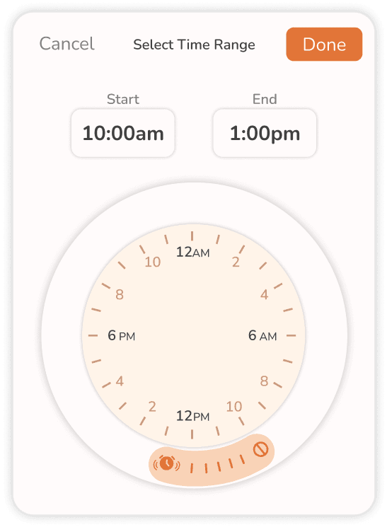
This feature allows users to automate sessions to block specific apps within a defined geographic “fence” or boundary. This allows for more granular control over app blocking settings based on their current location rather than just a weekly schedule.
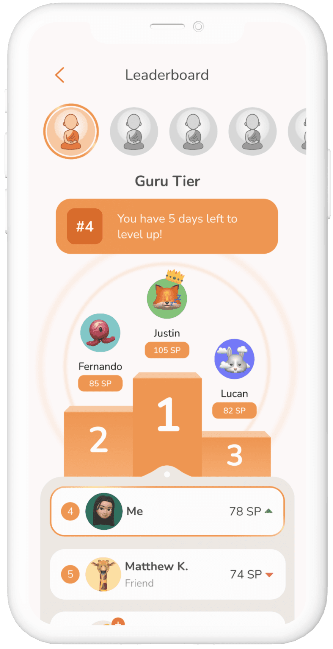
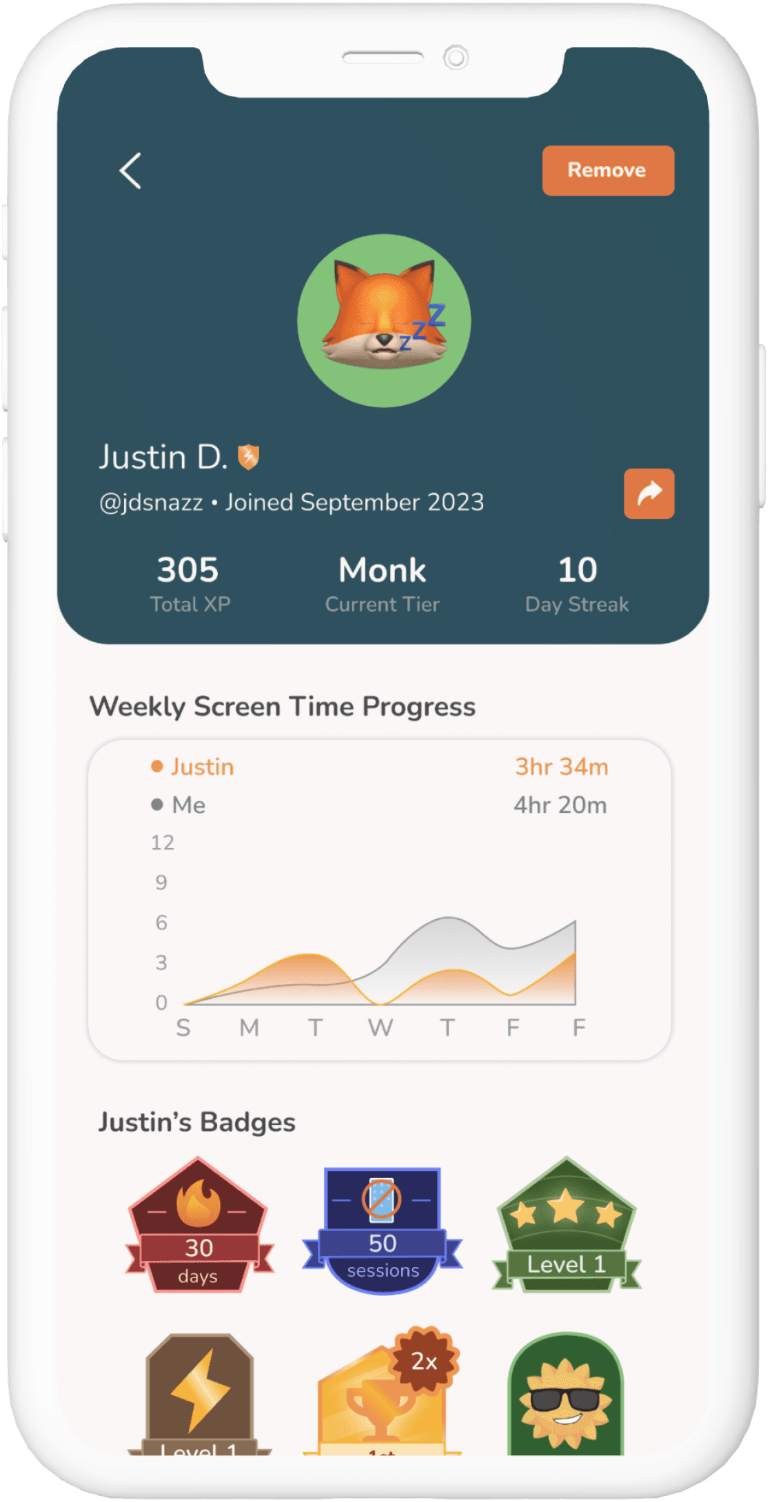
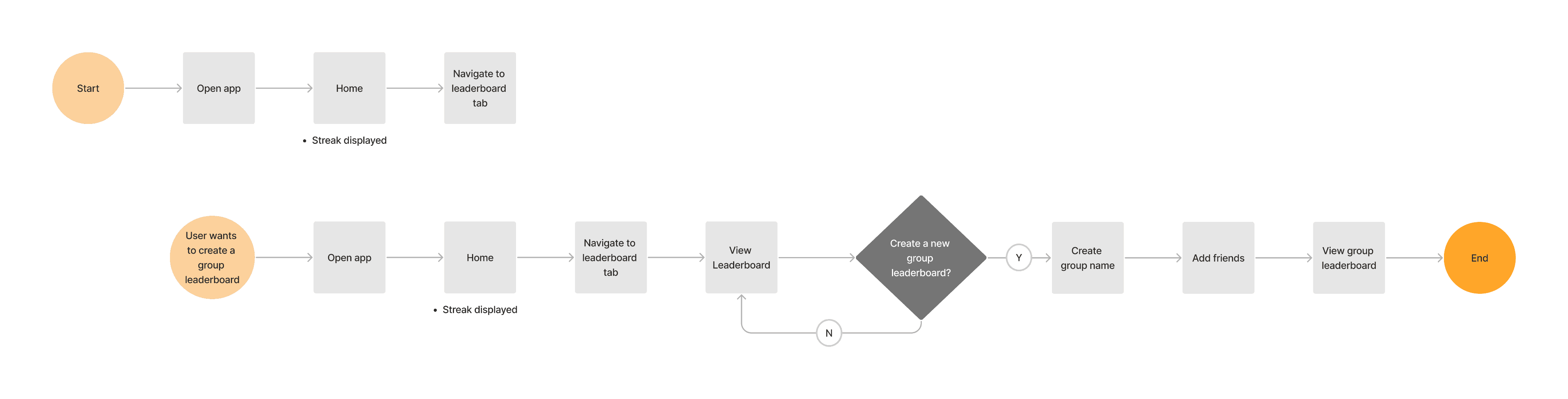
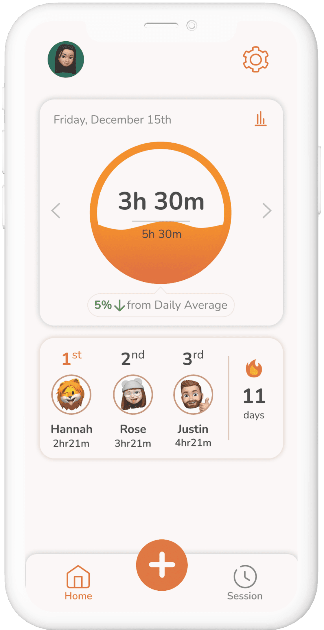
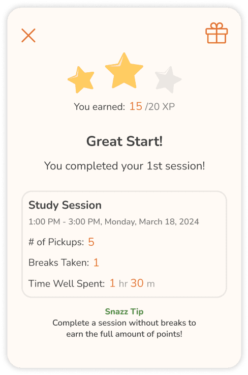
Incorporating Social Sharing and Gamification Mechanics
Certain users struggle with maintaining accountability and consistency while using our app.
This feature allows users to interact and compete with friends, family, and other users within the app. Users can also view and compare screen time progress as a way of keeping each other accountable and motivated.
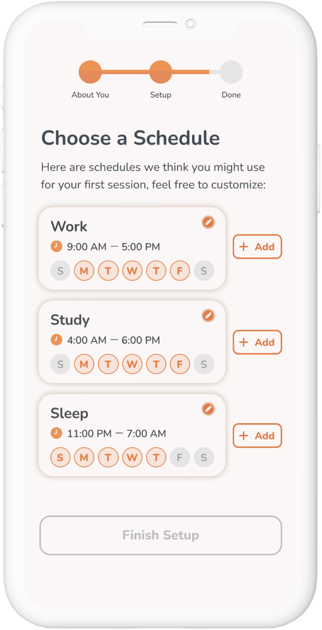
Improving the Value Proposition and App Usability
To ensure that users fully utilize the app’s capabilities, we revamped the onboarding experience to include:
Highlighting key features and functionalities to demonstrate how they can benefit users.
Ensuring a seamless and user-friendly onboarding flow that streamlines the registration process and provides clear guidance at each stage.
Providing personalized recommendations or suggestions based on users’ goals to demonstrate the app’s relevance and value to each user.
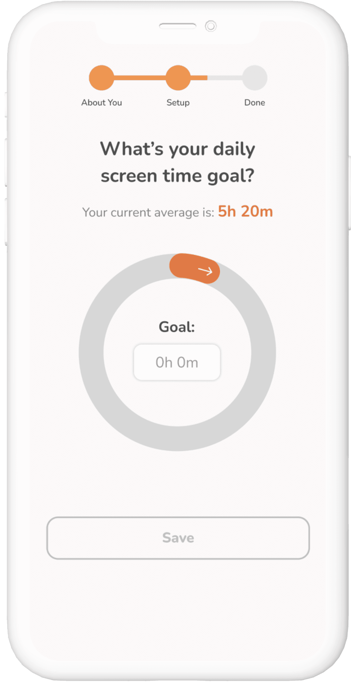
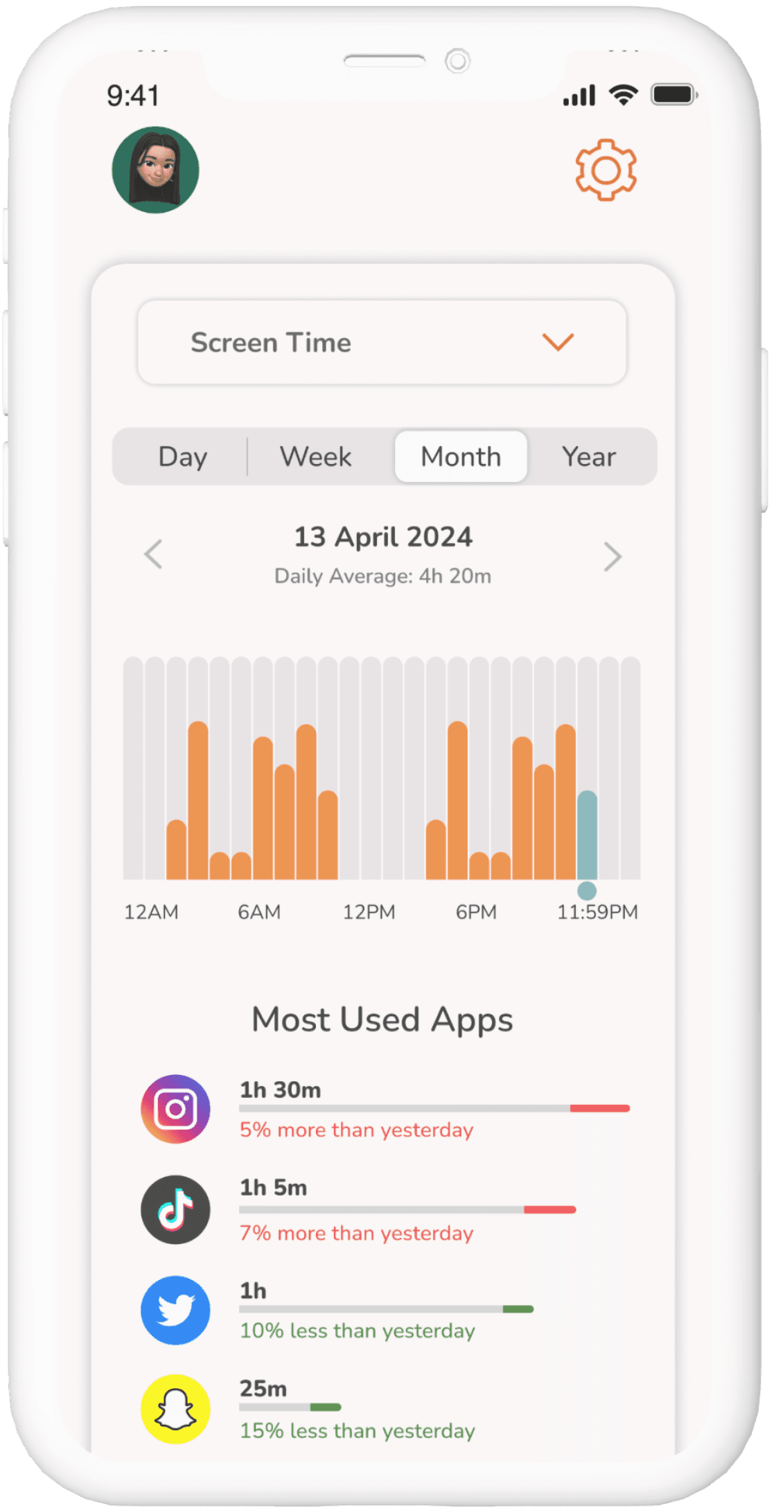
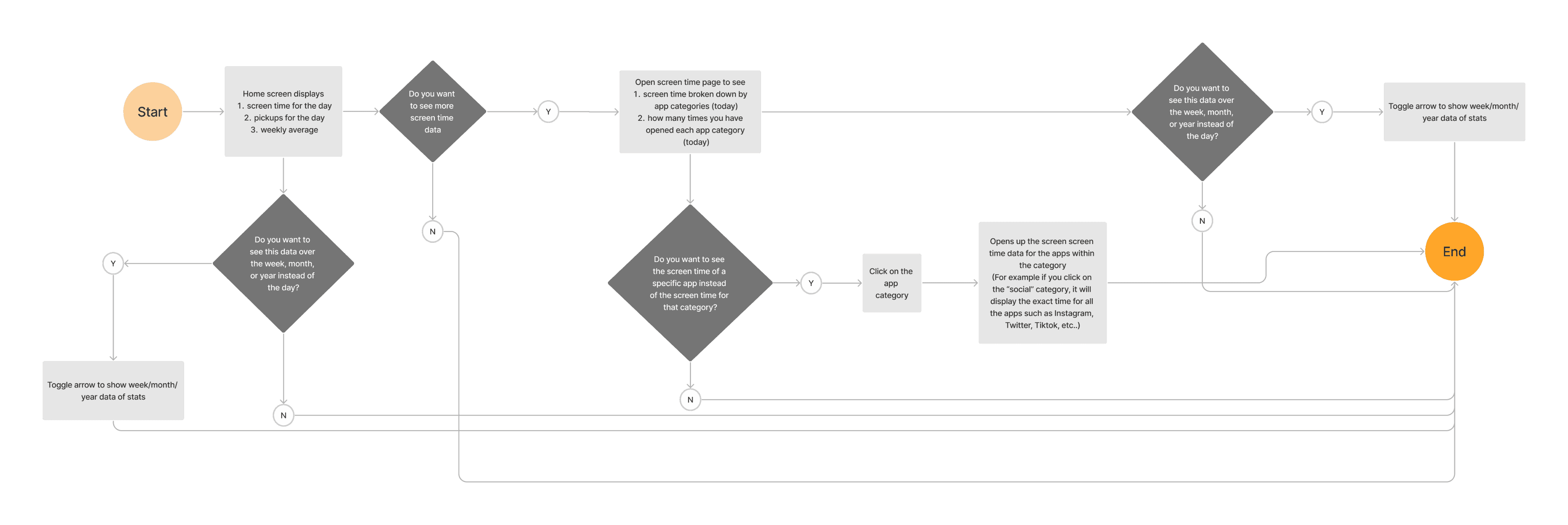
To help users better understand their digital habits and make informed decisions about managing their screen time, we:
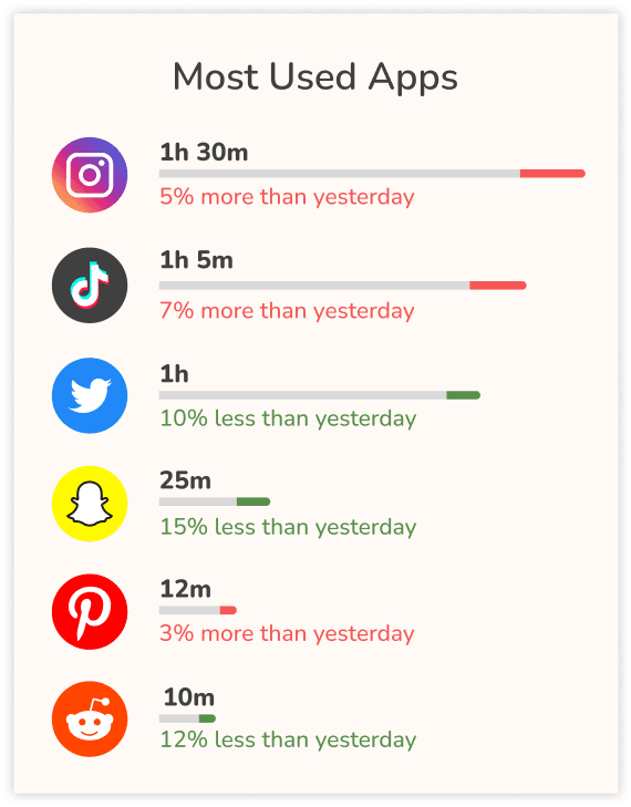
Visualized data through charts and graphs to visually represent the screen time data in a clear and engaging manner.
Integrated the home screen widget to display users’ total screen time as a reminder to achieve their goals.
Implemented alerts and notifications to notify users of deviations from their goals as well as proactive alerts to encourage users to take a break from their phones.
Establishing and Maintaining a Design System
To ensure design consistency and streamline collaboration with the engineers, we documented the style guide to help maintain uniformity across the app’s interface. Additionally, we conducted a reassessment of brand standards to prioritize user accessibility.
Logo

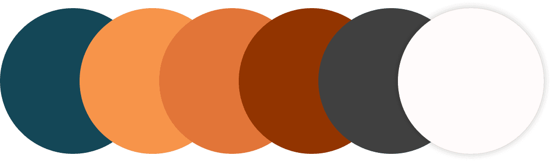
Color Scheme
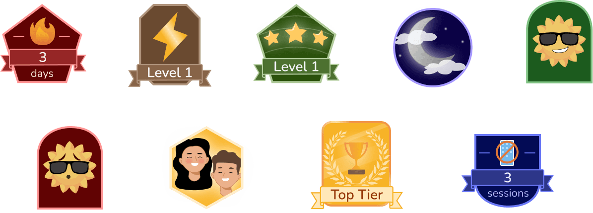
User Badges/Achievements
Testing With Our Users
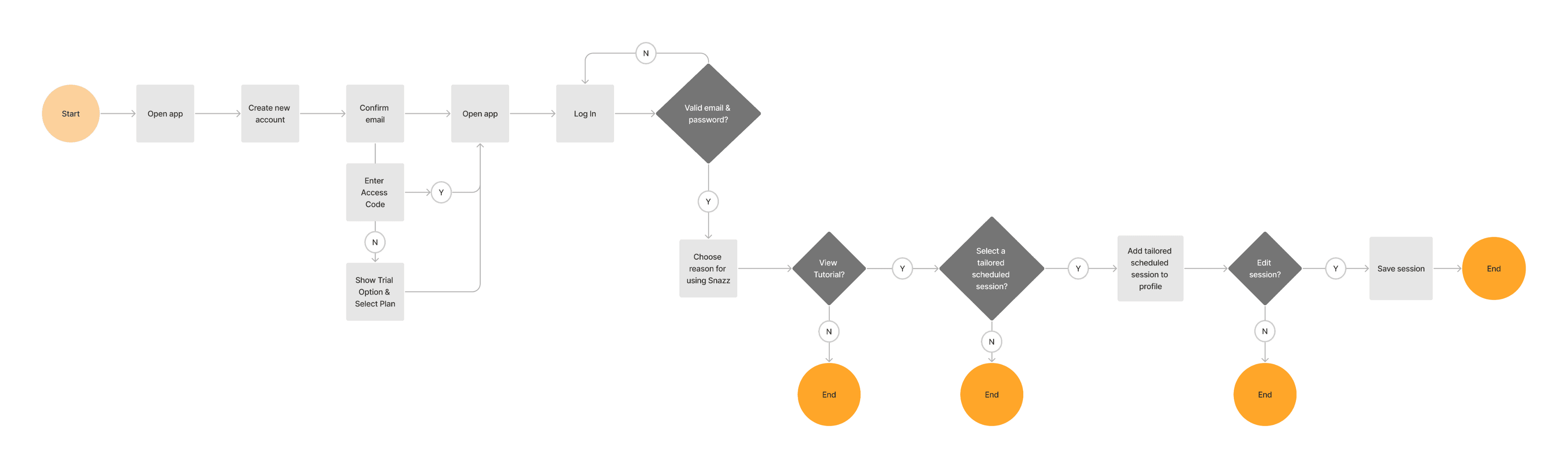
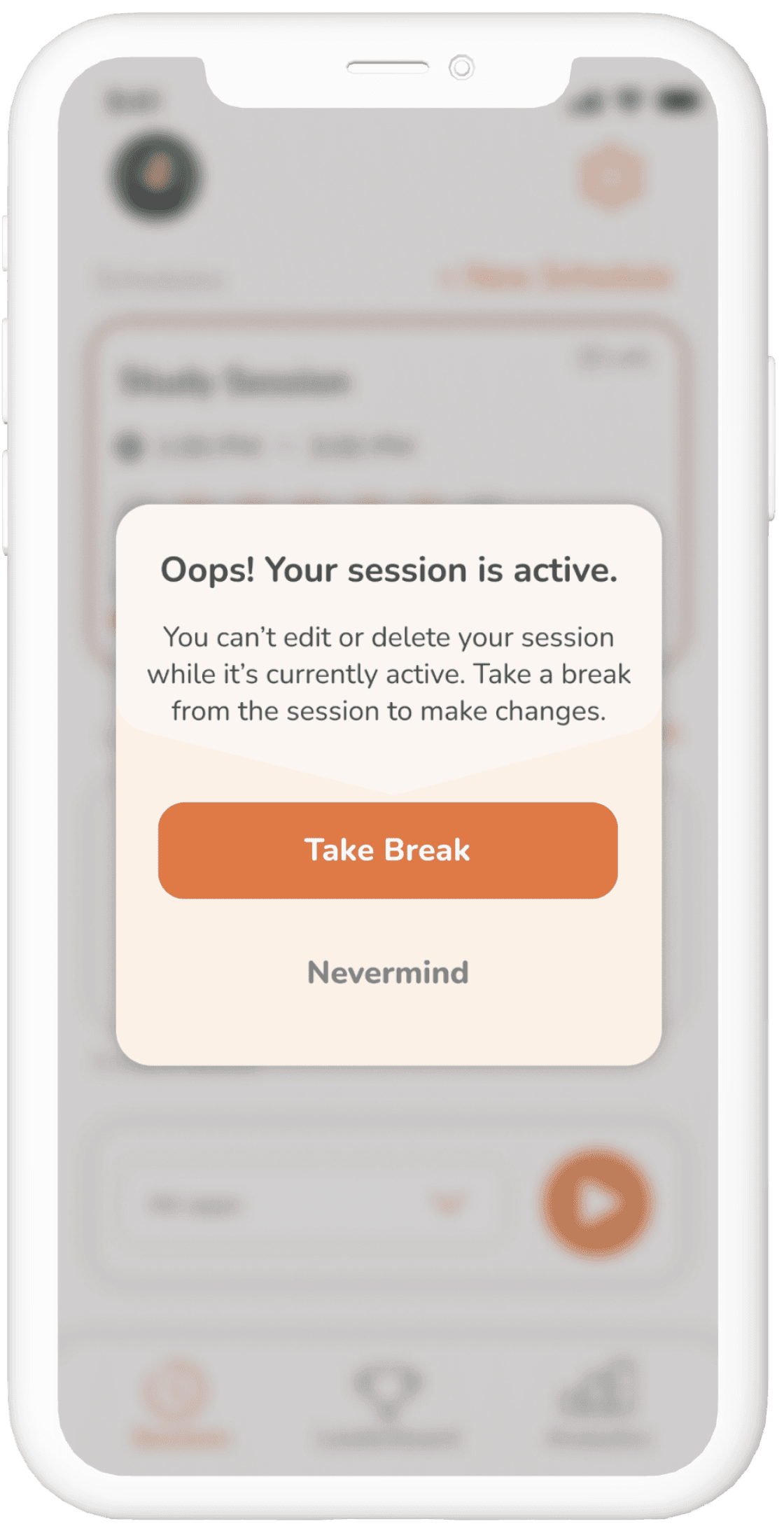
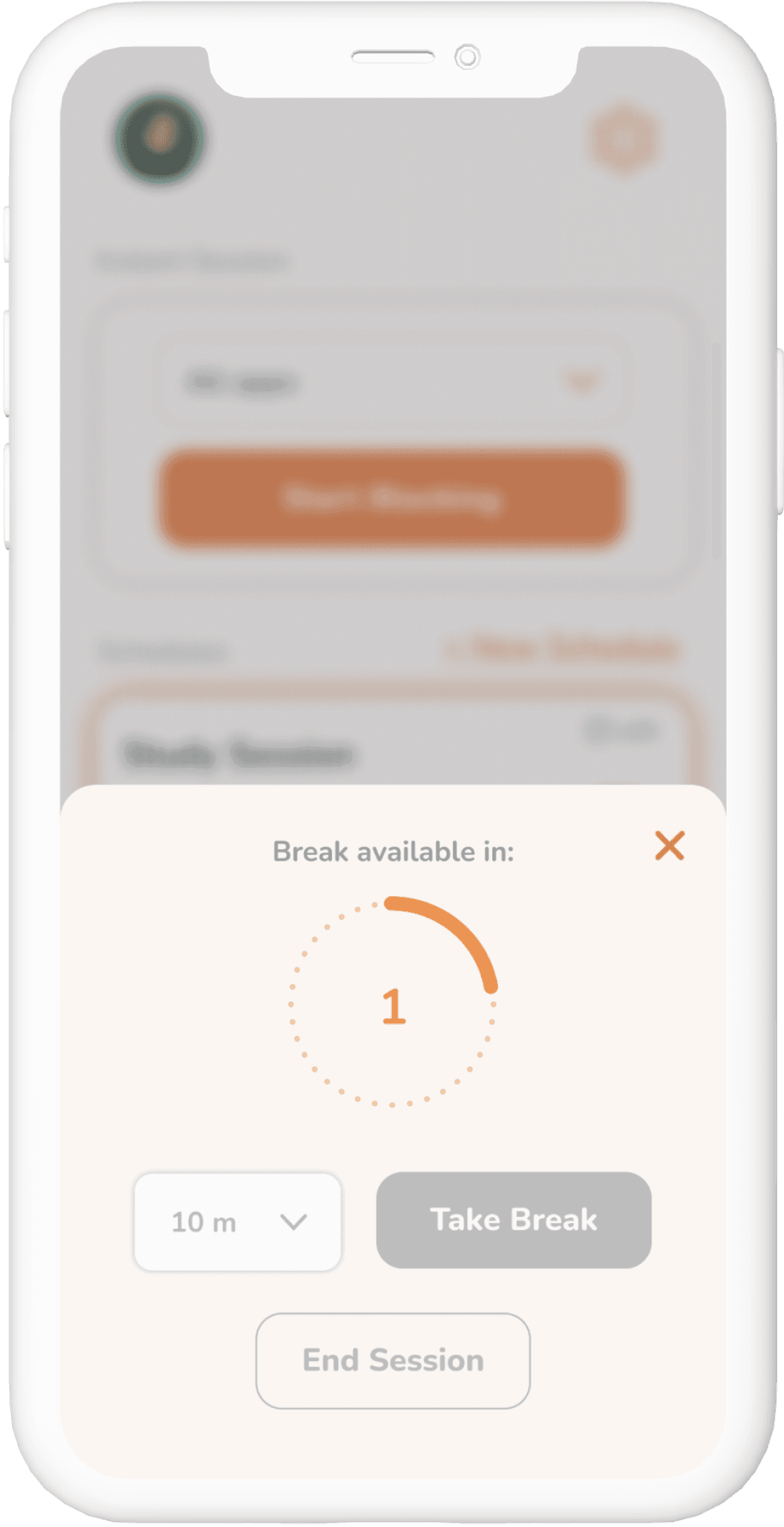
While our intention was to make it slightly challenging for users to end their blocking sessions as a strategy to resist the temptation to use their phones, this approach inadvertently led to frustration when users needed urgent access to their phones or specific apps.
To provide clearer guidance for users while still maintaining the challenge of ending or editing their blocking sessions, I redesigned the flow to incorporate informative messages and clearer labels.
The Mighty Pivot
Collaborating closely with our engineers, we uncover issues with Apple’s Screen Time API. Together, we pivot our app’s focus from screen time to productivity and digital wellness.
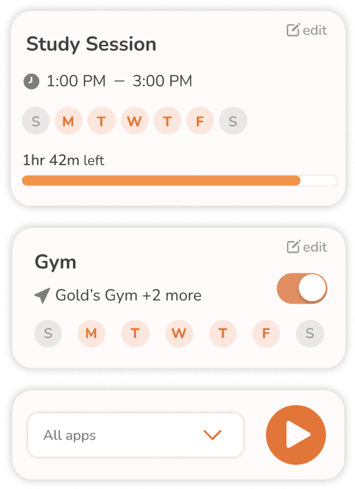
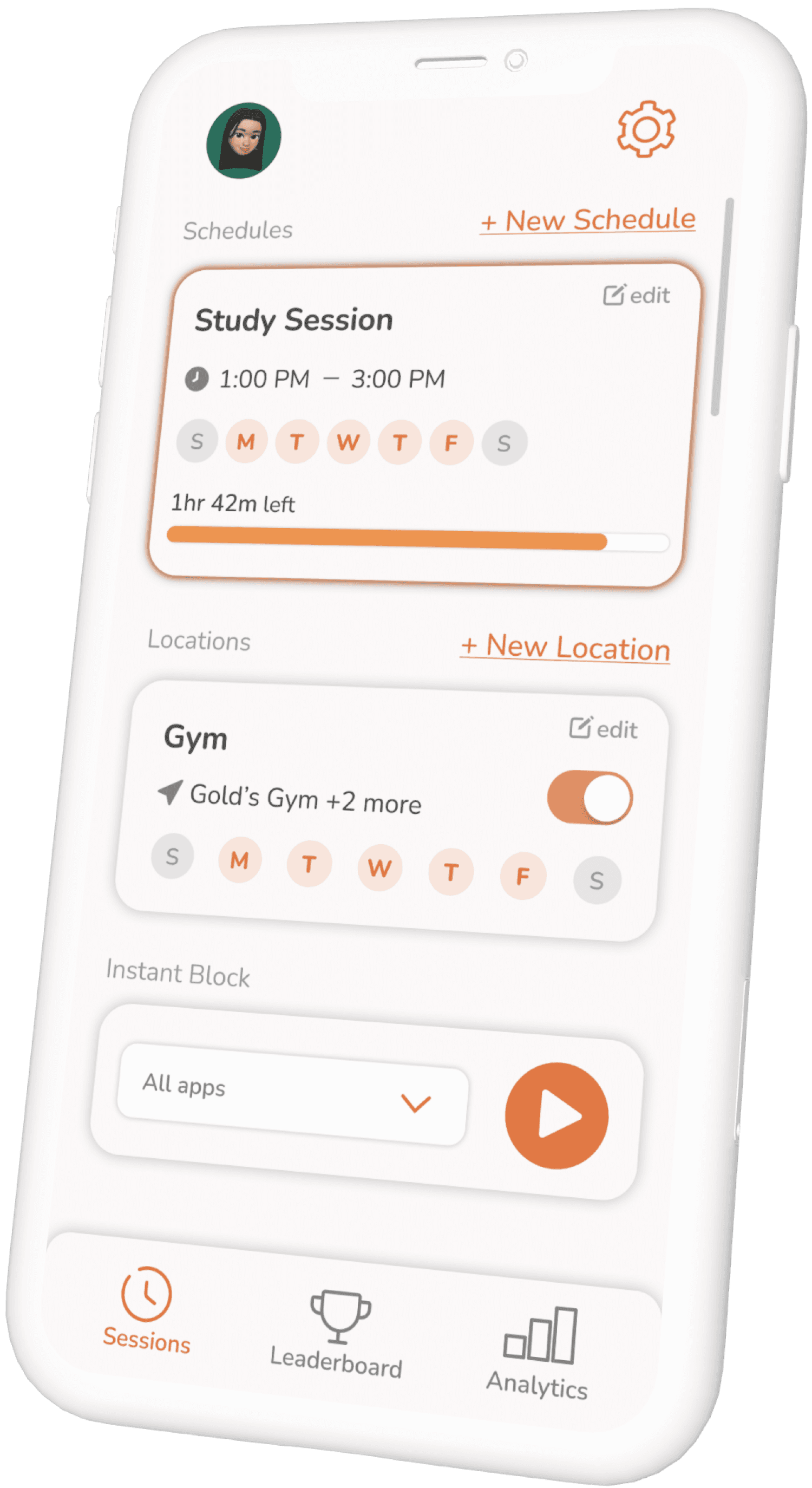
We implemented a significant change by replacing the home screen dashboard with the Sessions screen, providing users with quicker access to their sessions. The updated design includes sections that categorize different types of sessions, accompanied by a simplified navigation bar.
View Wireframes
Embracing Change
If there’s one thing I can take away from this project and startup experience, it’s the importance of adaptability in navigating changing circumstances. Transitioning from a team of three designers to becoming the sole UX/UI designer presented an exciting opportunity for personal and professional growth. Shifting our focus from screen time to productivity expanded our user base and enabled exploration into broader aspects of mental health & wellness.
With our shift into productivity, we have already embarked on a new project sparked by insights from user interviews, particularly around the topic of parental controls. Our goal is to develop this feature centered on parental guidance and safety, prioritizing support over strict enforcement.
Back to Top
Pet Doc - Case Study
Common Agency - Case Study


